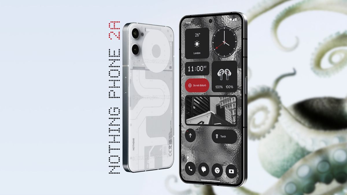

Nothing recently confirmed that the Nothing Phone (2a) is heading our way, but a recent leak suggests it won’t be bringing one of the smartphone lineup’s most iconic features with it.Smartprix and @OnLeaks worked together to provide a first look at the Nothing Phone (2a). There are two major differences between the budget-friendly (2a) and the flagship Nothing Phone (2).The most apparent difference is the back panel design. The Nothing Phone (1) and Nothing Phone (2) both featured a semi-transparent back panel design, which the (2a) drops entirely. Going with a different style for the back panel on the Nothing Phone (2a) helps set the more budget-friendly phone apart from its flagship counterparts. The leaked (2a) design comes with a pastiche of geometric shapes, two rear-facing cameras jutting out of the chassis, and a subtle Nothing logo on the lower left-hand side. This is a bit of a departure from the initial renders of the Nothing Phone (2a) we received back in December 2023.Deeper than designA render of the Nothing Phone (2a) based on leaked information showcasing the removal of the popular ‘Glyph’ interface. (Image credit: Smartprix and @OnLeaks)The second difference between the mid-range and flagship phones will have a deeper impact on the user experience. While many are fond of the semi-transparent look, it’s ultimately just an aesthetic difference. However, the Nothing Phone (2a) will also be dropping another major feature in addition to the translucent back panel – the glyph interface.Personally, I could do without the Nothing Glyph interface on its phones. I don’t find the LED light indicators help much, but the Nothing Phone (2) did improve over the Phone (1) in terms of Glyph features as plenty of folks wanted more. While we wouldn’t expect a budget phone to have more features, Nothing has claimed the (2a) will be a substantial upgrade over their original Android phone. Additionally, initial renders of the (2a) included some LED lights on the back panel in the same style as the Glyph interface. But this new render is flat and light-less. So, seemingly, no LED volume indicators, notifications, or timers will be visible on the rear panel.The semi-transparent design and Glyph interface of Nothing’s phones have become key selling points. So, these two changes together present a pretty large shift in design direction from Nothing. Though, it’s likely that the changes are cost-saving measures as the (2a) is poised to target a sub-$500 price point, after all.More from Laptop Mag


