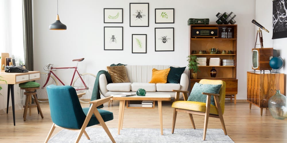
Interior designer Manuela Hamilford shared which items she would never have in her home. The designer avoids white walls, mass-produced artwork, and paper-shade lights. She also said accent walls and jewel-accented decor can sometimes look cheap.
Thanks for signing up!
Access your favorite topics in a personalized feed while you’re on the go.
download the app
Business Insider asked Manuela Hamilford, founder and principal designer of Hamilford Design, to share the items she wouldn’t have in her home. Here’s what the high-end designer, who specializes in luxury interiors and has been in the industry for over 25 years, avoids in her own space.Paper-shade lights lack originalityThough paper-shade lights are inexpensive, Hamilford would never want them in her space. She said they’re uninspiring and lack originality. Instead, she recommends investing in statement lighting. Pendant lights can give that dramatic look you’re going for — just make sure to use them in odd numbers if possible for a better look. White walls can be difficult to maintain over time
White walls can start to look dirty.
Yuganov Konstantin/Shutterstock
“White walls are tricky to keep pristine and don’t age well,” Hamilford told BI.Use textured wallpapers and interesting wall coverings, like wood panels, instead. If you can’t go all out in every room, start with a smaller space, like a half bath. You won’t find any accent walls in the designer’s space“Accent walls can make a space feel chaotic and can lead to the room being unbalanced,” Hamilford said. “It also takes the eye away from subtle details and smaller touches that you’ve made.” According to the designer, it’s imperative that you commit a room to a single scheme to create cohesion. If you must do an accent wall, choose a wall with a special architectural feature you want to highlight, like a fireplace or large window. Jewel-accented decor can come off as tastelessHamilford said she avoids decor with crystals, glitter, and diamonds. Many of these items attempt to appear high-end but do the opposite.“Although your inner 14-year-old may be drawing you towards all things shiny, back away from the crystal-trimmed cushions,” the designer told BI.You won’t find exposed wires or cords in her homeWires and cords should be placed behind the walls whenever possible, Hamilford said. If not, try to tether the wiring or disguise it. “You can use a wire cover if you decide to move your space around, but wiring and where appliances sit is something that should be preplanned,” she told BI.Dining benches may look nice, but they’re not comfortable
Dining chairs are far more practical.
Mike Higginson/Shutterstock
Looks are important, but practicality and comfort are essential in design, especially in a dining room. That said, she avoids dining benches without backings because they’re uncomfortable. Instead, she recommends banquettes or booth seating, which are cozier but still stylish. Matching bedroom sets can look dull and forced
Decor with matching colors and patterns can look impersonal.
Artazum/Shutterstock
Hamilford avoids matching bedroom sets in her home — especially wooden ones. Sets can look forced and dull, as if they were just picked out of a catalog without much thought.“If they are too matchy-matchy and take up lots of space, it gives the feeling that the homeowner doesn’t have much personal taste,” she told BI. She said a few matching pieces are fine, but think about pieces that can work harmoniously together. A room should tell people about your personality and feel layered and organic. Hamilford recommends staying away from slogan prints and mass-produced murals“Kitschy phrases are not artwork, they are not inspirational, they are mass-produced and cheesy,” she said. She’s not a fan of stock photos or mass-produced artwork, either. For a chic replacement, she recommends visiting thrift shops or art fairs to pick something more unique that represents you and your home. Improperly sized rugs can instantly ruin a room’s aesthetic
A small rug will make a room feel off.
Ground Picture/Shutterstock
Rugs are an important feature that can section a room and create different spaces, Hamilford said. Therefore, they should be neither too small nor too big. When choosing a rug, ensure that your furniture can fit entirely or partially on the rug. If some pieces are floating, you’ll need to size up. On the other hand, if a rug is too big, you may notice that the room just feels off.“It’s like wearing an ill-fitting suit. It just doesn’t look good,” Hamilford told BI. The designer avoids flush-mount ceiling lights in her homeFlush-mount ceiling lights are a no-no, especially in a dining room. The designer said if your room can handle something larger, you should position a bold lighting piece over the dining table instead.It’ll help make a statement and fill the space.


